
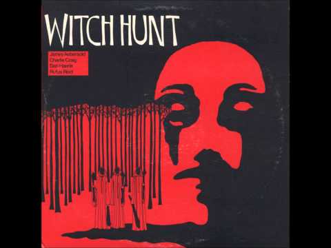
This one I’ve posted before:
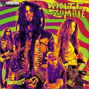
This is a friend’s musical project:

This one I’ve posted before:
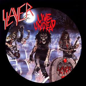
This is a friend’s musical project:
I love this one. It’s so repulsive.
I made a silk-screen of it when I was in an after school ROP class and made some shirts (lost long ago) and also screened it onto the back of my jacket.
#1 comment it would solicit . . . “Is that a PENIS on the back of your jacket?”

Yep that picture is horrendous. It’s one of those little fish that hang aboot shark’s gills isn’t it?

Yep that picture is horrendous. It’s one of those little fish that hang aboot shark’s gills isn’t it?
Lamprey.
They’re wicked little bastards.
The dudes that funded it or produced it ended up running a pretty major successful film studio or the like if I remember rightly.
You remember correctly.
coughMiramaxcoughWeinsteinCompanycough
The Burning is totally underrated. It also has a delightful synth score by Rick Wakeman.
Ah right…I remember being surprised with the success of the dudes behind it when I read it somewhere a few years back. And yes I do remember the score being scary keyboards for the most part. Poor Cropsey wouldn’t have had to waste the pesky teens if they didn’t fuck with him!!!
It also has a delightful synth score by Rick Wakeman.
Little known fact: Rick Wakemen ate his own heart out. True story!
After Akbar’s full-on assault of ‘deep cuts’, all I can do is post some more “obvious” entries to balance things out.
Here is one of those instances of a band’s best work and best cover art colliding (the nod to Bruegel the Elder’s “Triumph of Death” in the window is a nice touch):
[inline R-369572-1145132233.jpeg]
Here’s one whose music I have a diminishing interest in - not because it’s “bad,” I just find myself uninterested in ultra-complexity these days - but whose covers routinely get me to say “huh…I hadn’t thought of THAT before”:
[inline R-653759-1249563812.png]
This was a design ahead of its time - and much more ‘disorienting’ than ‘psychedelic,’ as the album itself is. Martin Atkins had a giant subway-tunnel sized print of this hanging in his studio lounge, unless maybe he’s sold it off with the last of the Ministry tour “fence links.” Must have been a bittersweet reminder of when he was at the forefront of innovation in pop music:
[inline R-315377-1266441046.jpeg]
Venetian Snares!!
bows
I fucking love them. Or him I should say.
Even if he is a crack smoking Canadian nutjob.
Here’s one Peligro once recommended me:
[image]http://www.roadburn.com/wp-content/uploads/2011/03/dragged.png[/image]
Also…
[image]http://www.mediaboom.org/uploads/posts/2012-05/1336763423_cathedral1991.jpg[/image]
I have that on vinyl. I could almost frame it and put it on my wall!
I was just about to post The Headless Children.
[reply]^THANKS!
I thought it was recycled imagery, but didn’t know what from. I just looked up the film. The posters are incredible.
The dudes that funded it or produced it ended up running a pretty major successful film studio or the like if I remember rightly.
I used to watch the Burning loads when I was a kid…it scared the pants off me. There’s a great scene where a bunch of pesky kids are on a raft and Cropsey jumps up and chops one of the teens fingers off with his hedge clippers!!![/reply]
and Costanza is in it!!! I watched it a bunch as a kid too…along with many other great early 80s slasher flicks…
Really? No one has done this one yet?

I believe it is 15 as of this month.

And since we’re talking about TKK in the other thread, this deserves to be here:
[image]http://www.jeffeaston.com/Music/Images/AlbumArt/MyLifeWithTheThrillKillKult_KoolerThanJesus.jpg[/image]
First cd of theirs I ever owned.^
Most of their album covers are great, this one wins in my opinion. Tells you everything you need to know about the band/music.
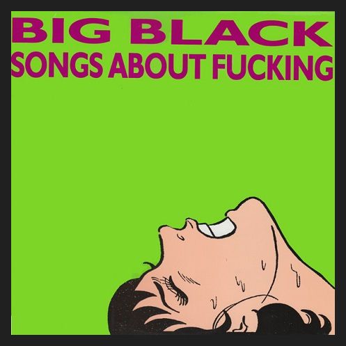
Wow - some serious synchronicity here, I was about to post “Kooler then Jesus” or one of the Big Black LP covers (I actually like the “Atomizer” art a little better, including the hilarious letter to their bassist from ‘The Electrifying Mojo,’ which is on the back cover.)
Here is one a fresh releases from some friends that just came out - and a design idea that I’m surprised hasn’t been utilized more:
[inline 39.jpg]
“Each record cover was finished with a shotgun blast,” according to the label’s promo text…
How do we not have a picture of the 'ed?

![http://www.roadburn.com/wp-content/uploads/2011/03/dragged.png[/image]](http://www.roadburn.com/wp-content/uploads/2011/03/dragged.png%5B/image%5D)
![http://www.mediaboom.org/uploads/posts/2012-05/1336763423_cathedral1991.jpg[/image]](http://www.mediaboom.org/uploads/posts/2012-05/1336763423_cathedral1991.jpg%5B/image%5D)
![http://www.jeffeaston.com/Music/Images/AlbumArt/MyLifeWithTheThrillKillKult_KoolerThanJesus.jpg[/image]](http://www.jeffeaston.com/Music/Images/AlbumArt/MyLifeWithTheThrillKillKult_KoolerThanJesus.jpg%5B/image%5D)